You’d Think …: I mean, really, it’s our national coat of arms, the arms of the United States of America. We’ve been using it for more than 200 years. And it’s not a complex coat of arms, consisting as it does of a striped shield and a plain chief, usually blazoned as Paly of thirteen argent and gules, a chief azure. With all that, you’d think that we’d be able to get it right. Unfortunately, you’d be wrong.
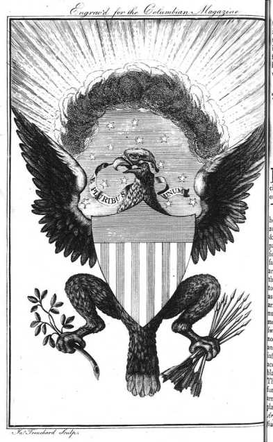
This is not to say that there are not a lot of correct renditions of the national arms. Here’s one from the late 1800’s that is drawn (and hatched, that is, showing the tinctures using the Petra Sancta system of varying lines to show the different colors: vertical lines for red, horizontal lines for blue) properly.
But too often, I run across renditions with one or more blatant errors in them. For example, this postcard from 1902 has the field correct, but makes the mistake of conflating the arms with the national flag and place stars on the chief.
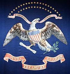
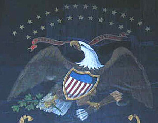
Or these two, in which the chief is fine (that is to say, plain blue), but which has the colors of the field reversed, making it red and white rather than white and red.
Then there’s this one, that not only reverses the colors of the stripes of the field, but also places stars on the chief.
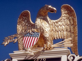
And finally, there’s this one, from a building in downtown Dallas, which has only 10 or 11 stripes on the field (it’s hard to be sure because of the shape of the shield), places stars (48, one for each state at the time) on the “chief”, and finally, divides the shield per fess, so that it is not a shield with a chief at all.
As I say, it’s our national coat of arms. You’d think, as simple as it is, that we could get it rendered correctly. But you’d be wrong.
You’d Think …
A resounding hear, hear to


