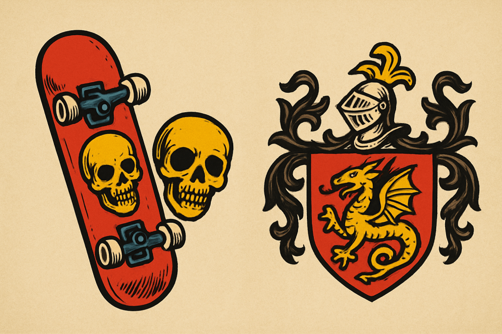
Recently, while watching Powell-Peralta’s Future Primitive, something I’d taken for granted in my youth hit me with unexpected clarity: the iconography of skateboarders isn’t far removed from medieval heraldry. The two seem like they belong on different planets—one born of knights and genealogical rolls, the other of concrete and rebellious energy—yet both compress identity into a symbol and send it flying into the world. That realization set me down a path to explore how closely these visual languages align, and how skaters like Tony Hawk and Steve Caballero, along with icons like the Powell-Peralta Ripper and Bones logos, developed imagery that functions almost exactly like modern coats of arms. Watching that film, I didn’t need to see faces to know who the skater was; I only needed to see their deck art.
Heraldry spent centuries refining the idea that a single image could carry lineage, allegiance, and aspiration. A lion isn’t just a lion. A chevron isn’t just a chevron. Every hue, every shape, every mythic beast lives inside a coded language that tells you who someone is before they ever speak. In the tournament lists of the Middle Ages, a knight could charge into the melee, fully armored and faceless beneath a visor, yet his identity was immediately clear. His shield and surcoat bore arms recognized across kingdoms: spectators knew which family he represented, which allegiances he honored, and even the style in which he fought. Just as much as the joust or melee tested his skill, these symbols projected his persona, allowing the crowd to read lineage, loyalty, and prowess at a glance—turning action into performance, and performance into storytelling.
Fast-forward to our era of action sports, and the parallels are striking. Skateboarding, at its heart, is a sport of display and skill, just as jousting was. The skateboard deck functions as a modern knight’s shield, a flat canvas painted with the rider’s personal armorial achievement. Safety gear—helmets, knee pads—echo the knight’s armor, protecting the body while leaving the graphics exposed to declare identity. And just as a knight’s reputation was built on how well he rode his horse through a tournament, a skater’s credibility is measured by how they ride their skateboard: the tricks, the speed, the control, the audacity. In both worlds, mastery of one’s mount is inseparable from the visual declaration of who one is.
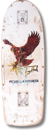
In the 1980s, films glorified these modern adventures, from Stacy Peralta’s documentaries capturing the early Bones Brigade to Gleaming the Cube, with its skater-hero seeking justice. In that film, Tony Hawk even drives a delivery truck topped with its own heraldic crest—the unmistakable Pizza Hut “hut.” The movie had all the hallmarks of a classic knight-errant tale.
Walk into a skate shop in the heyday of 1980s skateboarding, and you see the same heraldic impulse—but louder. The walls are ablaze with skulls, dragons, screaming hands, reapers, lightning bolts, and neon fever dreams. Nothing is accidental. A Powell-Peralta skull says something different than a Santa Cruz Screaming Hand. A Blind reaper says something different still. These images function exactly like heraldry did for medieval families: they declare belonging, attitude, and lineage. A deck graphic tells you who you ride with, what era shaped you, and what style you claim.
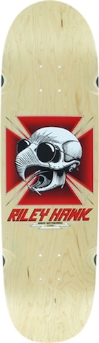
Some skaters leaned into this instinct so consistently that their graphics operate like personal coats of arms. Tony Hawk’s imagery is the most obvious example. His decks have been anchored for decades by variations of the Hawk skull and bird motif—wings spread, beak open, skull staring out like a guardian spirit of vert skating. It changed with the years, but the core identity stayed intact, as seen in . You could spot that graphic from across a ramp long before you could read his name. Like a medieval banner, it announced its owner at a distance.
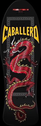
Steve Caballero built something just as enduring. His dragon became one of the most recognizable creatures in skateboard history—a coiled, fire-bearing beast drawn with a kind of medieval clarity and menace. It first appeared in the mid-1980s and never left him. The design evolved, but the dragon remained unmistakably Caballero’s. That consistency turned his boards into a visual lineage; you don’t have to squint or look for a signature to know who that dragon belongs to. It functions exactly like a heraldic charge passed down through generations.
To understand why these symbols land with such force, it helps to remember where skateboard graphics came from. In the 1960s and most of the 1970s, skateboard decks were visually restrained—mostly logos, simple stamps, or block lettering. They behaved more like sporting goods than cultural artifacts. It wasn’t until the late 1970s and early 1980s that skateboard art exploded into full illustration. Artists like Wes Humpston, Jim Murri, and Jim Phillips broke the silence with bold, detailed, mythic, punk-tilted artwork. Suddenly boards weren’t just equipment—they were declarations1.
Few graphics shaped that era like Powell-Peralta’s. The Ripper, created by Vernon Courtlandt Johnson (VCJ) in 19832, might be the most iconic skateboard image ever printed. The skull tearing through a paper-thin surface feels both playful and rebellious, as if the symbol itself is trying to claw out of its constraints. It wasn’t originally meant for a board at all—it began as a shop sticker, turned into apparel, and only later became a deck graphic. That accidental evolution makes it even more heraldic: a symbol born from utility that grew into identity.
Another Powell-Peralta icon, the Rat Bones (or Vato Rat), reaches even deeper into skateboarding’s history. Its roots stretch back to graffiti and early Dogtown skate culture, where the rough lines of alley-art and punk sketches shaped how skaters represented themselves. When Powell-Peralta adopted and refined the graphic, it became a bridge between skateboarding’s raw, street-level origins and the polished but still rebellious visual language of the 1980s3. Even today, the rat still feels like an emblem of the sport’s outlaw DNA.
This is where the comparison to heraldry really comes alive. Heraldry wasn’t just decoration; it was lineage made visible. Skateboard graphics do the same. A kid skating a Hawk or a Cab deck may not skate like their heroes, but they’re participating in a visual inheritance. They’re choosing a crest. They’re placing themselves inside a story. They are akin to the squires and pages who wore the livery colors of the knights they served. They showed their allegiance.
Both traditions rely on repetition. A heraldic device only gains meaning when it’s used across generations. A skateboard graphic gains its power when it appears year after year, sometimes across decades, mutating slightly but never losing its core identity. Hawk’s bird. Caballero’s dragon. The Ripper skull tearing into daylight. These images grow heavier with each new printing, each reissue, each rider who adopts them. We can even see the generational use of such imagery in the deck art of Tony Hawk’s son Riley, which paid homage to one of his father’s earliest designs.
The settings couldn’t be more different—castles and tournaments on one side, skateparks and pools on the other. One was seen as noble and the other rebellious, but both absolutely high-adventure. Yet the human instinct remains constant. We look for symbols that tell the world who we are and where we belong. Medieval knights painted their shields. Skaters screen-printed their decks. Both meet the same need for recognition, myth, and identity in motion.
Once you notice the parallel, it becomes impossible to unsee. The dragons, skulls, flames, and beasts of skateboard art would fit comfortably in a medieval bestiary. The bright tinctures and bold lines echo the clarity heraldry demanded. And the consistency with which certain symbols follow certain figures feels as old as the idea of a crest itself.
The past and present are always closer than they appear. Sometimes all it takes is a dragon on a skateboard or a skull ripping through plywood to show just how thin the line between them really is.
